
Learning in Public: Reflections From a Viral Side Project
What I learned when my experimental side project hit the front page of Hacker News

It Started with a Question
What if we could make manipulative design patterns not just visible, but tangible in a safe environment?
As a product manager, I’d spent a lot of time thinking about how design influences behavior—for better or worse. But explaining dark patterns to others, especially those outside the tech bubble, always felt abstract and theoretical. I wanted to change that.
The idea was simple: a minigame that doesn’t just reveal dark patterns but makes people experience them. It wasn’t meant to be a polished product or a portfolio piece. This was an experiment—a way to learn frontend web development and test how design could teach through interaction. Every decision felt like a question waiting to be answered.
At first, I kept the scope small. No flashy features, no extras—just the core mechanics to test if the idea resonated. I wanted the project to feel intentional, even in its simplicity.
Could the game communicate the nuances of manipulative design patterns effectively without overwhelming users? That was the challenge I set out to solve.
What began as a quiet learning project slowly gained traction. Encouraged by early feedback, I shared it more widely with newfound confidence of its value, thinking:
If even one person learns to spot these patterns, it’ll be worth it.
Then, on Friday, everything changed.
The game hit the front page of Hacker News, and suddenly, my little experiment was being tested live by thousands of users across the globe. What followed was equal parts thrilling and humbling—a crash course in building, iterating, and learning in public.
The First Version: Intentionally Incomplete
When you're building solo, every feature is a highly consequential choice. Each new component isn’t just more code—it’s added complexity to manage with tight resources. From experience, I knew how easily scope creep could derail projects, so I relied on this principle to guide my design and development decisions.

The navigation was one-way only: no back button, no lesson jumping. The UI was stark, with minimal styling to avoid distractions. Success messages automatically advanced after each correct answer. These limitations weren’t oversights—they were deliberate choices tied to specific hypotheses:
One-way navigation: Would linear progression result in actual completion, or would users become frustrated and disengage?
Minimal UI: Could lessons stay clear and engaging without unnecessary design flourishes?
Simple feedback: Would straightforward success messages motivate users to finish all 10 lessons, even with the imperfections of this version?
Measuring Success
To measure success, I used a simple to implement yet effective approach: users had to complete every lesson to reach the end, where I embedded a newsletter signup. If I received any signups, it meant the game was being completed—and that people were interested in more.
Validation came unexpectedly. After connecting with
over a shared appreciation for building with Claude Artifacts on Substack Notes, he featured the game in his newsletter Department of Product and it was also picked up by the TLDR Design newsletter. Nearly 2,000 users tried it in a single day, with overwhelmingly positive feedback from the design and UX communities.Engagement and Growth
What stood out wasn’t just the praise—it was how people engaged with the game. Users weren’t just completing the lessons; they were sharing it through word of mouth and social media. Every share reinforced the value users found in the game, even in its imperfect form.
This validation gave me the confidence to iterate thoughtfully. For example:
Mobile users struggled with certain interactions, prompting me to focus on responsive design improvements.
Each update prioritized amplifying what worked while addressing what didn’t.
Within days, the game began to evolve from a personal experiment into a legitimate teaching tool.
Encouraged by this progress, I decided to try sharing it on Hacker News again. My first attempt with Version 1 had just a single upvote. This time, things were very different.
When Your Experiment Goes Viral: The HN Moment
Watching your side project climb the ranks of Hacker News is equal parts thrilling and terrifying. Every design detail—and every flaw—is suddenly under the scrutiny of thousands of highly engaged and skilled technologists.

Teaching Dark Patterns, Creating New Ones
In a game designed to teach about dark patterns, I inadvertently created a few of my own.
One notable example was the Misdirection Pattern lesson, placed midway through the lesson sequence. After three lessons focused on teaching users to avoid dark patterns, this one flipped the script—it required players to intentionally fall for one. This abrupt shift in game logic confused players, effectively gaslighting them for the remaining questions. Many were left unsure whether the goal was to spot or succumb to dark patterns from that point onwards.
This misstep was a stark reminder: focusing too much on individual components can blind you to the overall user journey. By optimizing for isolated scenarios, I’d unintentionally undermined the game’s larger educational experience. It was a humbling lesson in maintaining consistency and clarity when designing for learning.
Design Decisions at Scale
Small design choices I made early on revealed larger UX issues when tested at scale:
Automatic timers: I had a 3-second timer for automatic progression after completing lessons that was too quick for many users. During a peak-traffic hotfix, I extended it to 5 seconds while fixing a background rendering issue. I justified it as partly for chaos, partly for science—what better time to test user patience than when thousands are actively engaged? Unsurprisingly, it frustrated others. A full rework became necessary in the next update.
No lesson skipping: Early versions required clear, sequential instructions to compensate for the lack of navigation flexibility. But when navigation was later made flexible, those same explicit instructions turned the experience into a dull clicking exercise rather than an engaging puzzle.
Deep Engagement and Feedback
The feedback from users extended beyond content or pacing. Players engaged deeply with the game’s core concept, offering:
Detailed critiques of question design, prompting the removal of weaker lessons.
Validation of the concept’s educational potential and ideas for growth.
Specific suggestions to improve game mechanics.
Insights into technical issues I’d overlooked as a novice developer.
Feedback on device-specific experiences, particularly on mobile.
The mobile experience was especially eye-opening. Fancy background animations that looked great on desktop crippled performance on smaller devices. Navigation designed for desktop felt clunky on touchscreens. Perhaps most surprising, mobile users made up over 60% of all players—far more than I had anticipated.
The Value of Public Feedback
For a product creator, this kind of engaged feedback is pure gold. Controlled user research sessions might yield polite suggestions, but seeing thousands of real users actively engaging and debating improvements with brutal honesty was like mainlining pure user insight.
The engagement from the Hacker News community lit a fire under me. Thousands of users found enough value in the game to give it a try, and many shared it or offered thoughtful feedback. That response gave me the motivation to iterate further, transforming this experiment into something more complete.
Listening, Learning, and Leveling Up
When thousands of users encounter your product at once, the challenge isn’t finding what to fix—it’s deciding what to fix first, especially when you’re handling everything yourself. To stay focused, I asked myself one question:
What changes would most improve the learning experience and best serve the user’s interests?
Setting Expectations
The first improvement was adding an onboarding screen before the lessons. This set clear expectations—a kind of mini contract between the game and the player—and gave me a framework for evaluating future updates.

Optimizing for Engagement
My biggest priority was optimizing mobile performance and reworking the lesson flow. I implemented a two-stage system for each question to improve clarity and engagement:
Stage 1: The challenge, with better context to help users understand how to interact with the scenario.
Stage 2: Informative content, providing detailed explanations and reflections to reinforce learning.
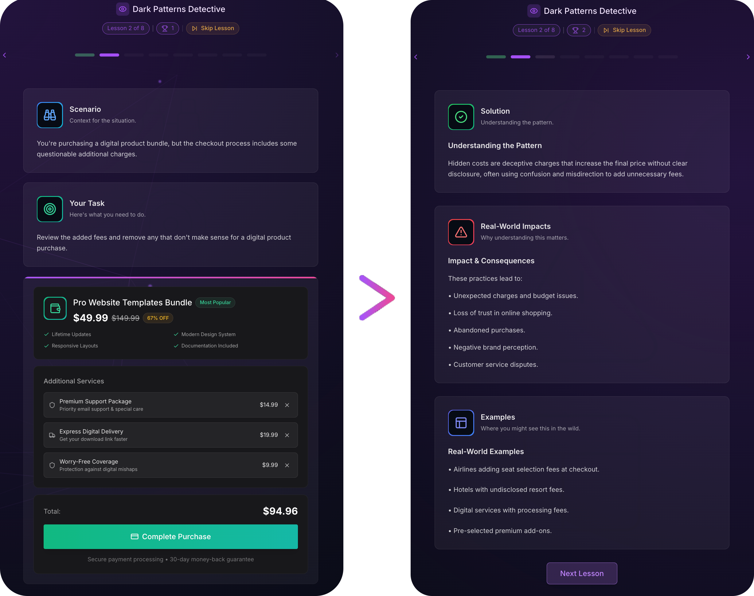
This structure allowed users to:
Actively engage with the interactive challenges first, making the experience more intuitive and immersive.
Reflect and learn through deeper content afterward, giving context and meaning to their actions.
Control their pace while keeping the educational concepts distinct from the tasks.
Clarifying the Content
I reworked each lesson to answer three guiding essential questions for the user:
What is this dark pattern?
Why does it matter?
Where might you encounter it?
This clarity ensured that every interaction had purpose and left no ambiguity.
Unlocking Unexpected Use Cases
What surprised me most was how people envisioned using the game:
Educators saw its potential for classrooms.
Privacy advocates saw it as a tool for helping older and younger adults navigate digital spaces.
These unexpected use cases validated the game’s educational focus and opened exciting possibilities for future iterations.
Lessons from Building in Public
Looking back, I’m grateful I didn’t wait for perfection. If I had tried to build the “complete” version first—as I’ve done with many half-finished projects—I might still be tinkering in isolation. By starting small but functional, I learned from thousands of real users what actually mattered.
The most powerful insight wasn’t about specific features or bugs—it was about approach. Every product manager talks about user-centered design and iterative development, but experiencing it firsthand—watching real people engage with something you’ve built—brings those principles to life in a way no framework ever can.
The most valuable lesson from building in public?
Your assumptions will be wrong, and that’s okay.
The key is making space for these discoveries early, while your product is still flexible enough to adapt. By keeping the core experience simple, I created room to learn from users who showed me what they actually needed—not what I assumed they wanted.
I hope that sharing the evolution of this project—and the reasoning behind the decisions I made—serves as a helpful case study for others. Whether you’re designing games, building tools, or working on entirely different challenges, the same principles apply:
Start small but intentional.
Stay open to feedback and surprises.
Iterate thoughtfully based on real-world engagement.
The dark patterns game—and future games—will continue to evolve. Each update brings new insights, new opportunities for improvement, and inevitably, new challenges. But now, it’s growing with purpose, shaped by feedback from a community that cares about digital literacy as much as I do.
Great products aren't born from perfect plans—they emerge when we're brave enough to put our experiments in front of real users and learn from them.
Keep Iterating,
—Rohan

P.S. If you want to play the game for yourself, you can give it a go here.
Help me decide what to write about next by answering this poll:
Thanks for reading! If you’ve found value in these ideas, there are three simple ways to share your support:
Like and Share: Spread these ideas to others who they may resonate with.
Subscribe for Free: Get future posts delivered straight to your inbox.
Become a Paid Subscriber: Support my work (and caffeine addiction).
Let’s connect! Find me on LinkedIn, Bluesky, Threads, X, or drop me an Email. I’m always open to interesting discussions and opportunities.
Congrats Rohan!! This is great 🙌🏻
This is pretty awesome. Love it.