Beyond the Wait: The Evolution of Loading Bars
How Loading Experiences Shape Our Digital Experience Through Psychology and Innovation
Ever wondered how a simple loading bar makes waiting feel less tedious? Discover the evolution of loading bars and how their design and psychology transform our digital experiences, keeping us engaged and enhancing user satisfaction.
Sections We’ll Cover:
Introduction to the Loading Bar
How Loading Bars Shape User Experience
The Evolution of Modern Loading Interfaces
The Future of Loading Interfaces
1. Introduction to the Loading Bar
The loading bar, a deceptively simple yet ingenious innovation, has revolutionized our transition from a tactile, physical world to a digital one. By turning interaction feedback into a visual form, it exemplifies outstanding interface design. Instead of pressing a button and relying on the sensory feedback of hearing, feeling, or seeing the machine operate, users now receive clear visual confirmation. This small element provides psychological reassurance, ensuring users that the system is actively processing their requests.

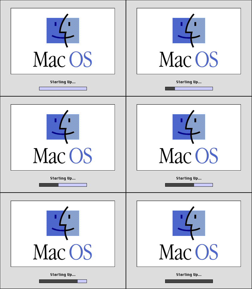
A loading bar is a type of progress indicator that visually displays the completion percentage of a task. These indicators are versatile, appearing on almost all types of devices and in various programs. Some loading bars display progress through a filling bar that changes color or moves from left to right, while others include numbers showing the exact percentage of completion for more precise feedback. Additionally, some use animations, such as spinning wheels or bouncing balls, to visually communicate ongoing activity.

In the realm of User Experience (UX), loading bars are essential feedback mechanisms. UX design aims to create intuitive and satisfying interactions between users and digital products. Providing feedback, like a loading bar, is crucial because it informs users that their actions are being processed, reducing uncertainty and frustration. This feedback loop is a fundamental principle in UX design, ensuring that users feel in control and informed throughout their interaction with the system.
Think of it as having a conversation with your device. In daily interactions, we rely on visual cues to understand that someone is processing information before they respond. For good interaction with a computer, we need similar visual feedback to feel assured and connected, mirroring our natural communication patterns.
Progress indicators benefit users at all levels. Novices feel more comfortable knowing their commands have been accepted and tasks are progressing. Experienced users benefit by being able to estimate completion times, allowing them to plan their activities more effectively, which is especially valuable in multi-tasking environments with multiple windows, such as desktop interfaces. Experimental evidence shows that users prefer systems with progress indicators, making the extra effort to include them in product designs worthwhile.
2. How Loading Bars Shape User Experience
At the core of the loading experience is a focus on human interaction design. A 1968 paper by Robert Miller remains relevant in human-computer interface design today. Miller highlighted that progress indicators like loading bars convey some essential messages to the user:
Their request has been acknowledged.
The system is processing their request.
The system is actively working on a response.
Human perception of time is fluid, and the design of a progress bar can greatly influence how long a wait feels. By understanding common perceptual tendencies, designers can create universally satisfying experiences. This approach applies to web and app design, software updates, and customer service interfaces. By focusing on these shared perceptions, we can develop progress bars that enhance user experience across all types of digital interactions, making them smoother and more enjoyable for everyone.
To understand this better, consider these three important time thresholds when designing interfaces:
0.1 Seconds: This is the limit for making the user feel the system is reacting instantaneously, requiring no special feedback.

<1 Second Example: Apple MacOS Application Opening Bounce Animation (Source) 1 Second: Within this timeframe, the user's flow of thought remains uninterrupted, though they will notice the delay. Minimal feedback is needed here.

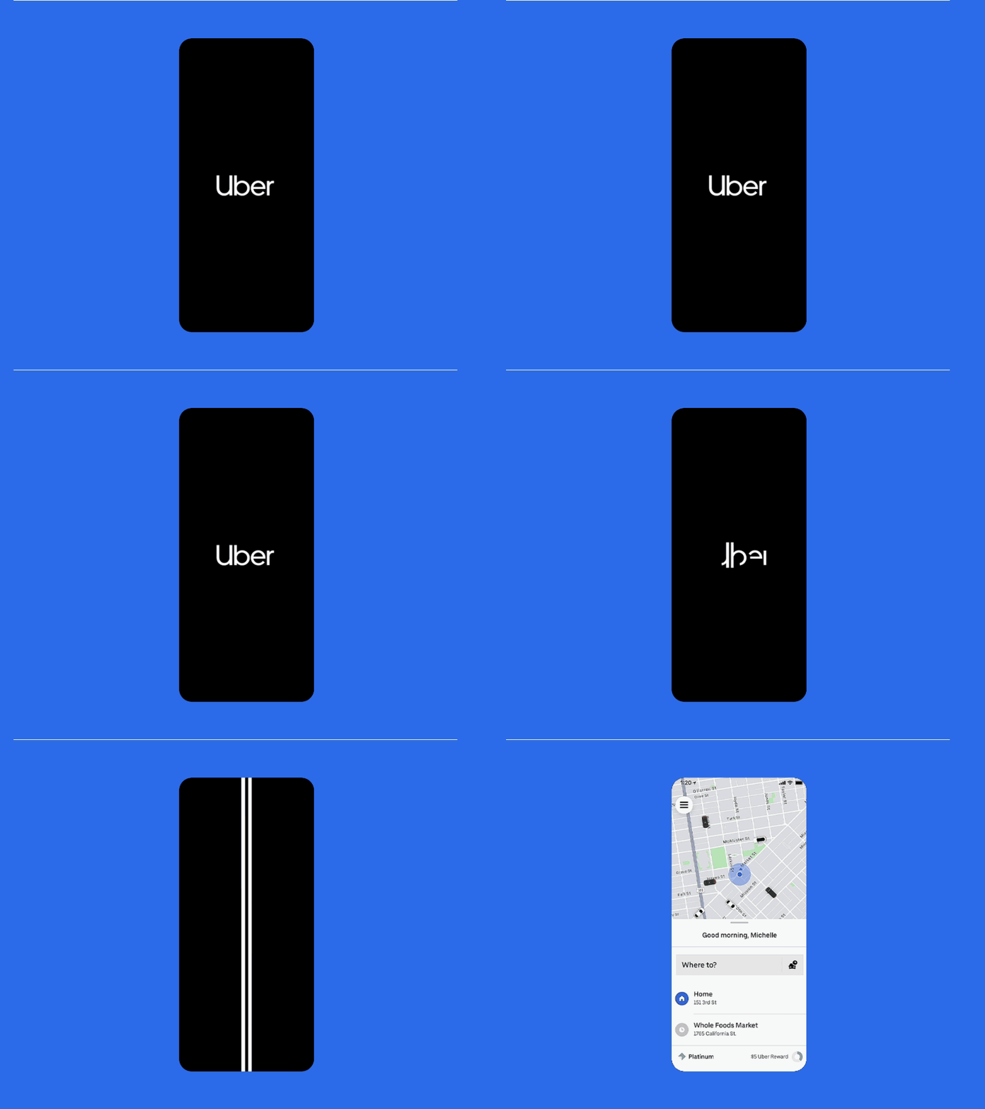
1 - 10 Second Example: Uber’s Splash Screen Transition while Fetching Live Data (Source) 10 Seconds: This is the upper limit for maintaining the user's attention. Beyond this, users tend to switch tasks, so providing feedback about the expected completion time is crucial. Feedback is especially important if the response time is variable, as users need to know what to expect. Therefore for any operations expected to take more than about 10 seconds some sort of progress indicator is key to empower a user to decide whether to do something else while waiting for the task to complete, restart the task at a different time, or abandon the task.

>10 Second Example: Estimated Times Help Manage User Expectations for Longer Waits (Source)
The design of a loading element can be broken down into frontend and backend components—how the progress is displayed to the user and how this information is determined. Early progress indicators were tightly coupled with backend processes, often overwhelming users with unnecessary information. Good design shields users from backend complexities while providing necessary feedback.
When designing any product, understanding the computational processes in the background is key to enhancing user experience. Loading indicators generally fall into two categories based on the predictability of the task duratio

Determinate: Used for tasks with well-defined durations, providing a clear sense of progress.

Indeterminate Loading Animations - Bar and Circle (Source) Indeterminate: Used for tasks with uncertain durations, such as loading or synchronizing complex data.
Some products transition between determinate and indeterminate loading indicators to better communicate progress. This blend of indicators can enhance the user's understanding and patience during longer or complex processes. It is best practice to keep progress indicators moving to reassure users that the system is still working. A stationary indicator can be misinterpreted as a stalled process or frozen app. If a process does stall, provide clear feedback to help users understand the issue and what actions they can take.

A 2010 study showed that visual effects, like pulsating and animated ribbing, improve how fast progress bars feel. In four experiments, the best design was a backwards-moving, decelerating ribbed bar. Compared to a standard bar, this design made the wait time seem 11% shorter, even though the actual wait duration for participants didn't change.
3. The Evolution of Modern Loading Interfaces
Building on the importance of loading bars in user experience, modern technology has advanced to create more engaging loading experiences. The goal is to minimize perceived waiting times and interruptions, ensuring smooth and seamless interactions. With the aid of high-speed internet, advanced processors, and optimized code, content can be delivered almost instantly, enhancing user satisfaction.
There are various ways to show progress, such as displaying the completion of different functions within a script. These tasks may vary in complexity, resulting in non-linear progress. Over time, loading bars have evolved from simple bars to more interactive designs, incorporating animations, interactive elements, and gamification to make waiting more enjoyable and immersive. This approach distracts users and keeps them engaged with the product, so they may not even notice the wait.

For example, Ubisoft’s Assassin’s Creed series uses interactive loading screens to keep players immersed. Instead of staring at a static screen, players can control their character within the game's simulated world, allowing them to stay engaged without breaking their focus or becoming distracted. This approach leverages multiprocessing, with the loading happening in the background while some computational power is used to deliver this interactive experience. It keeps the product engaging and sticky, turning what could be idle time into an opportunity for continued interaction.

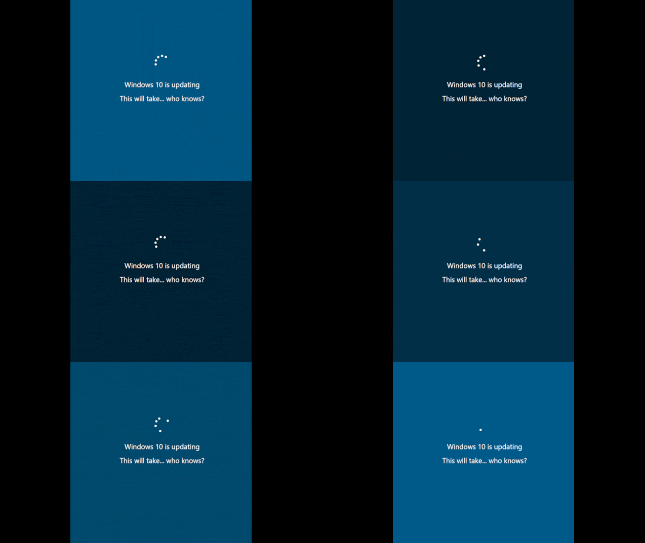
Interestingly, a frictionless approach isn't always the best or most feasible solution. Dummy loading bars, which do not accurately reflect actual progress, are strategically used to manage user expectations and keep them engaged. These bars show movement and activity, providing reassurance that the system is working. For instance, Windows operating systems often use dummy loading bars during system updates, creating the illusion of steady progress even when the actual update process is variable and unpredictable. By showing activity, dummy loading bars can reduce anxiety and impatience, even if the background process is slower than the bar suggests.
The evolution of bars, especially in gaming, shows a clear user experience benefit in creating more immersive environments. Despite the trend towards seamless designs, dummy loading bars remain useful. They may not reflect actual progress but reassure users that the system is working. By showing movement, these bars reduce anxiety and impatience, even if the background process is slower. However, if the loading process encounters an issue or takes significantly longer than expected, it can leave users uninformed and unable to take appropriate action, highlighting the importance of balancing immersion with clear communication.
4. The Future of Loading Interfaces
As technology advances, the need for waiting periods in digital experiences is decreasing, though they will never be entirely eliminated. Different products have varying requirements for loading times. For example, AR and VR demand minimal latency to maintain their immersive experiences, while users in 3D rendering workflows are willing to wait longer for high-quality results rather than settle for instant but lower-quality outputs.

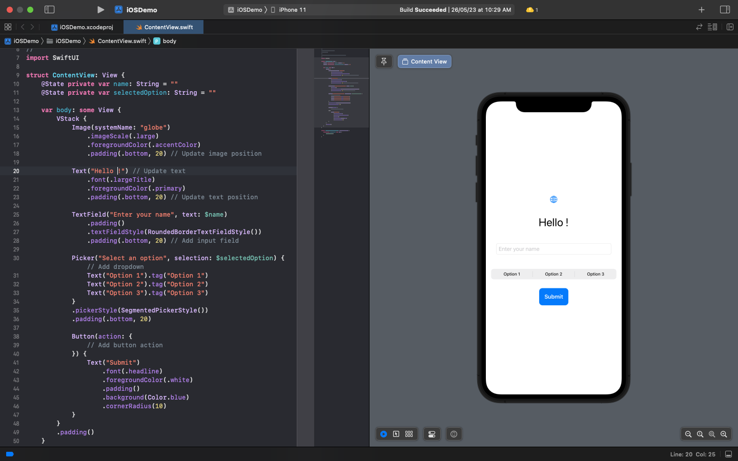
Advances in computing power, such as multithreading, enable background processing, allowing tasks like rendering to occur without interrupting the user's workflow. For instance, coding in Swift with Apple’s XCode offers dynamic previews, reducing the need for traditional loading bars.
Loading bars are becoming less common in modern computing, with exceptions like software updates. Many products now offer scheduled updates during off-hours to avoid disrupting users during their active time. Even when updates are scheduled to avoid disruption, the push for constant engagement can have negative consequences, such as promoting behaviors like doom-scrolling. Platforms like Netflix autoplay trailers while browsing, which can help users decide but also extend the decision-making process, keeping them engaged longer than necessary.
Looking ahead, the challenge for designers and developers will be to innovate in ways that minimize wait times while maintaining healthy user engagement. For example, thoughtful integration of micro-interactions during brief pauses can keep users informed without leading to over-engagement. Similarly, adaptive loading indicators that respond to user behavior and context can provide a more personalized experience.
As we strive for seamless digital experiences, it’s essential to balance efficiency with user well-being. By integrating meaningful feedback and maintaining moments of pause, we can enhance the user experience without contributing to the addictive nature of modern technology. The future of loading interfaces lies in finding this equilibrium, ensuring that technological advancements continue to improve user satisfaction in a healthy way.
Thanks for reading!—Found value in this? Three ways to help:
Like, Comment, and Share—Help increase the reach of these ideas
Subscribe for free—Join our community of makers
Become a paid subscriber—Support this creative journey
Keep Iterating,
—Rohan


